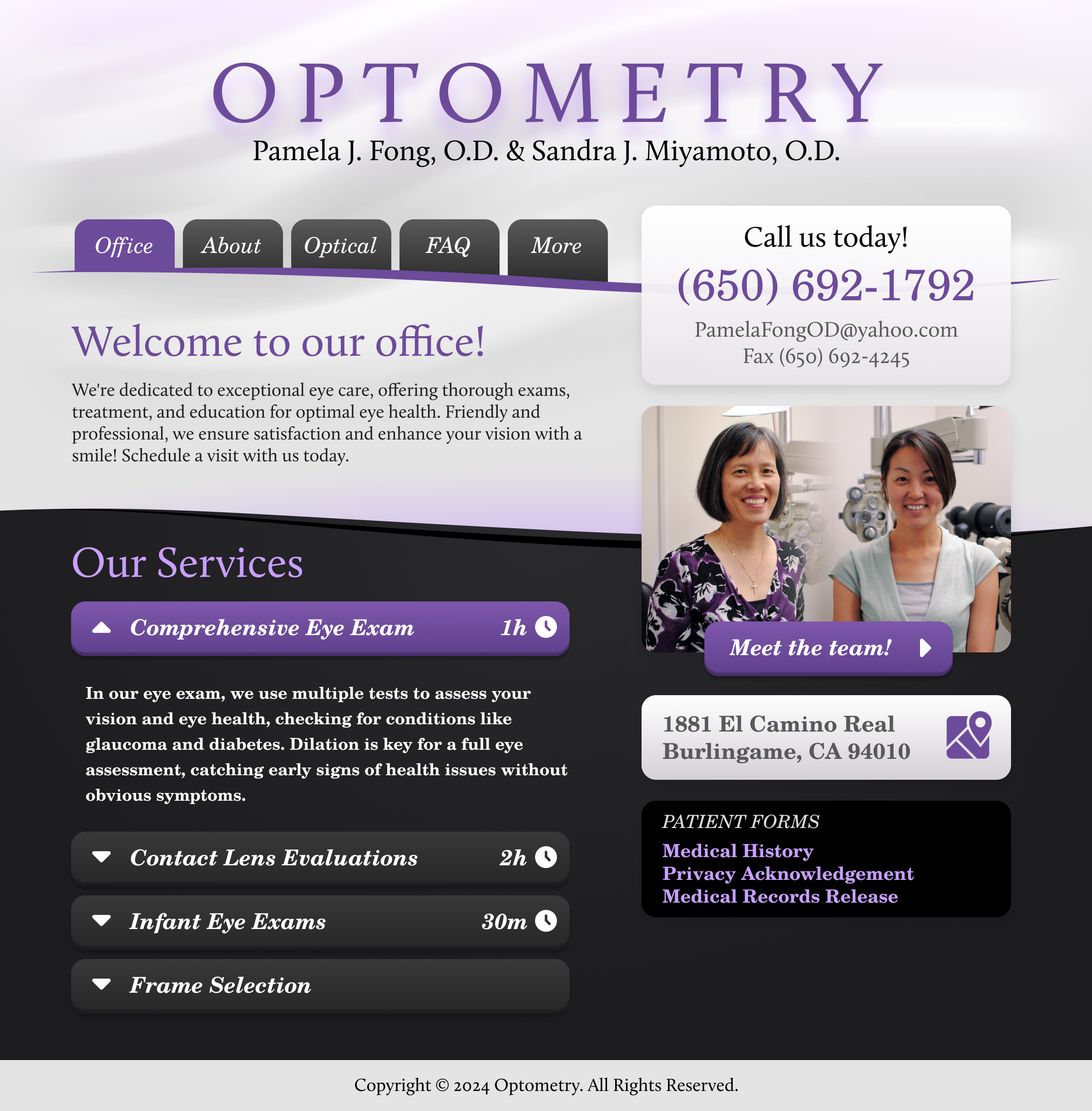
In redesigning this optometry website, the client wanted to present a clear mission statement with details about the offered services. The former site was text heavy and not accessible to those with visual impairment (the irony!).

Considerations for this design:
- Cognitive Load: Including large paragraphs of text may lead to inaction. I tucked the large collection of information into tabs and section toggles to reduce complexity.
- Default Bias: People tend to stick with the default options or feel understood if you align with their intent. Most visitors come for eye exams, so that toggle is open by default.
- Priming: Stimuli will influence a user’s decisions. The silky background texture, paired with the carefully chosen purple, creates a comfortable vibe to influence their future visit.
- Accessibility: Using larger text with acceptable contrast is key to serving those with visual impairment.
UX psychology plays a big part in getting a design right. This design was crafted to respect established experience patterns to leads to conversions.