
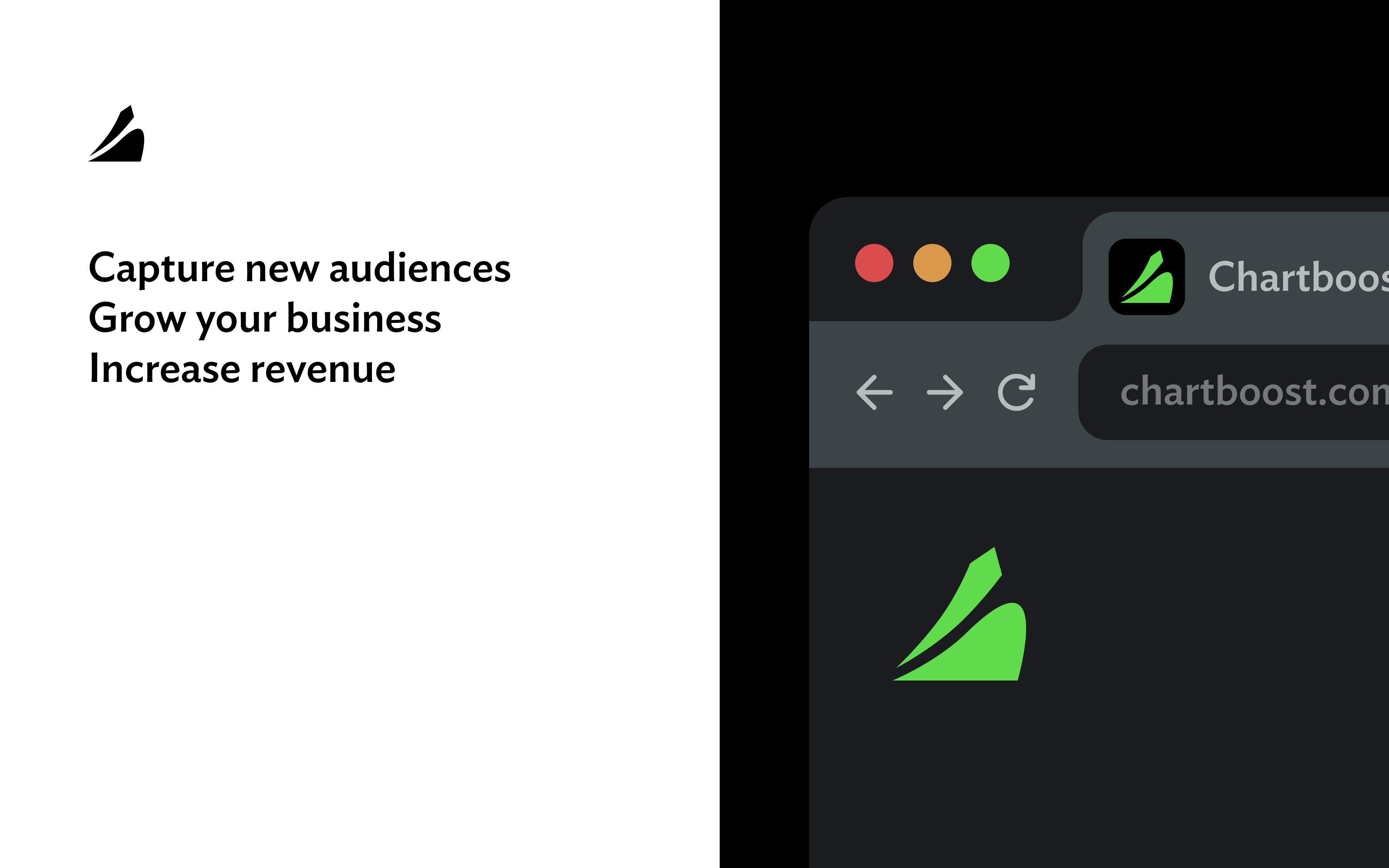
The client was building the leading in-app monetization and programmatic advertising platform, Chartboost. They need a logo that captures the essence of the product, visually convincing their B2B customers to adopt their platform.
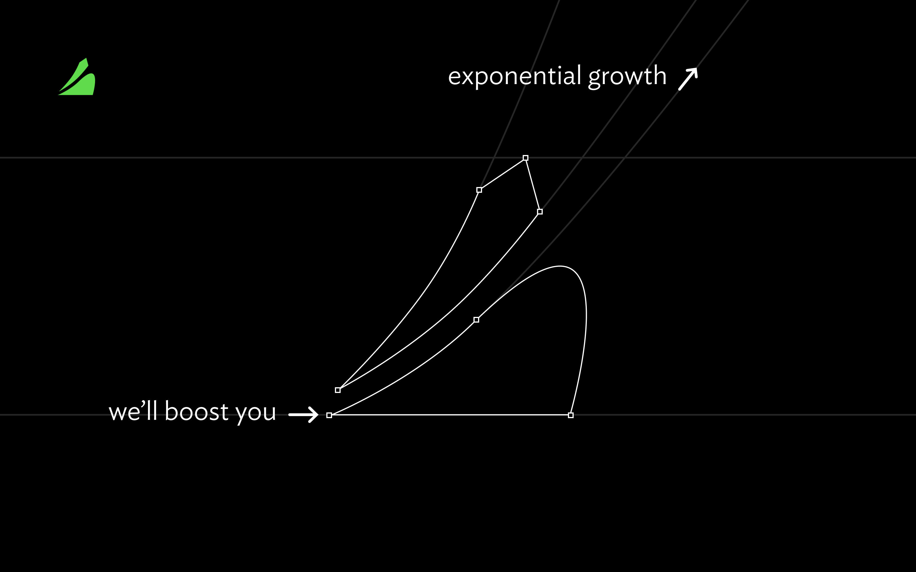
After a myriad of logo explorations, we landed on this one: a ramp that launches you to the moon. The lines skeleton of the shape communicates exponential growth.
While the color blue was typical in mobile apps and in the B2B market, I opted for green. It better communicates “growth” by invoking a botanical vibe, and it aligns with the colors business owners may be accustomed to (stock charts).
Designed in 2011, the branding has remained strong through 2024, even after its acquisition by Zynga.